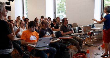
The Data Journalism work sessions aim to be practical meetings with two objectives: to learn about and delve deeper into working with data through workshops, and to present and showcase local projects.
«Excel and Google Drive for Journalists» Workshop
By Gilbert Martínez, economist and web analyst at Sekuenz.
The objective of this workshop is to learn to extract data mixed with blocks of text, filter them and order them into a visual and simple form using Excel. It will show the flexibility of dynamic tables for classifying the information to suit, and present examples of the graphics available on Google Drive.
«Google Fusion Tables» Workshop
By Eduard Martin-Borregón, from Data’n’Press
Google Fusion Tables is a Google web service for data management, which provides a means for visualising data in different types of graphics and geographical maps.
Getting the Best Out of the Web with Scraping
By Michael Bauer
In this session we worked on basic concepts of web scraping based on a small number of simple tools. Scraping refers to the extraction of information or data from a website or a PDF to work with them on a spreadsheet or so that they can be used on different visualisation platforms.
Where can we find public data, in what format, and how often are they published?
By Àngels Llorens
Àngels Llorens shows us how to locate data in the sphere of statistical information on the demographic, social and economic situation. She shows us formats, their possibilities and their limitations. She explains what tabulated data are and how to access microdata.
Good practices in information visualisation
By Víctor Pascual
Víctor Pascual focused on common errors and explained new techniques. Workshop was focused on the most basic theoretical concepts of information visualisation. When is it necessary to make use of a bar graph? When is it not a good idea to use a pie chart? Plus, new “visual metaphors” were introduced that facilitate understanding of sets of complex data.
Workshop on Working with Geospatial Data
By Óscar Marín
The workshop begun with an introduction to the different geographical formats and the most common ways of obtaining geospatial data. Then, there was an introduction to the Global Database of Events, Language and Tone (GDELT), which includes the records of worldwide protests since 1979. Finally, we used CartoDB to visualise and generate maps based on this database.
How to decipher data from statistics portals
By Xavier Badosa
The aim of this workshop is to present possibilities for the reuse of data from an official statistics office such as Idescat. The organisation of information at Idescat explains and examples shown of downloads of data, of the embedding of solutions already produced and of the consumption of services. In the sphere of data visualization, an explanation offers of Google Public Data Explorer where Idescat offers a set of municipal and regional data as well as the Idescat Visual library.
Visual: the Idescat data visualisation solution
By Xavier Badosa
Visual is the open code solution developed by the Institute of Statistics of Catalonia (Idescat) to complement its tables of statistical results with graphs and maps. The session describes its characteristics and shows how to install this solution and use it with real statistical data.
Google Fusion Tables Avanzado
By Antonio Delgado
This practical workshop shows us how to personalise maps developed with Google Fusion Tables, as well as their integration into websites or data projects. In order to be able to follow this workshop you will need to have a basic knowledge of HTML, CSS and Javascript.
Workshop «Visualize Data Easily with Tableau»
By Eduard Martin-Borregón
Tableau is a tool for the visualisation of data in maps and graphs. During the workshop, all its capacities are demonstrated through a practical exercise based on data from municipalities in Catalonia.
Workshop «Learn to Visualise Twitter and Facebook Data Using Gephi»
By Natalia Mazzote
Gephi is an open-code programme that allows you to visualize and consult graphs. It can be used in sectors as varied as politics, health, social networks, etc. Media such as The New York Times use it to visualise the global connectivity of their contents and Twitter uses it to examine network traffic around determined events. The truth is that Gephi offers the possibility of managing thousands of nodes and of working while carrying out large-scale analysis. This workshop introduce us to Gephi as users, based on data from the two most widely-used social networks: Facebook and Twitter, while explaining basic graph theory concepts such as hubs, nodes and types of networks. To follow the workshop it is necessary to have Gephi installed on your computer. To download it please go to: http://gephi.github.io/users/download/
“Web Scraping” beginners workshop
By Ben Welsh
Data often appear in formats that we haven’t mastered or in non-uniform ways. Scraping helps us to get around this, because it allows us to extract hidden data from websites, PDFs, etc. for subsequent use. In this workshop Ben Walsh will explain the tools required to extract data from the Web using Python programming language.


Leave a comment