
At a time when journalism is undergoing a profound crisis as a result of the rise of social networks, financing difficulties, and increasing layoffs in the media industry, the 1st Data Journalism Conference organised by the Spanish chapter of the Open Knowledge Foundation opened up a new direction for the profession; a future that paradoxically goes back to its origins: to the search for new sources, to objective accounts of events and to data analysis.
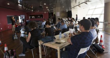
The conference took place on 24, 25 and 26 May in Barcelona, Madrid, Seville and San Sebastián. In Barcelona, the CCCB was the venue for the first day of the conference, which lasted twelve hours and featured the participation leading experts in field of data journalism, including Mar Cabra, one of the coordinators of the event along with the journalist Karma Peiró.

Mar Cabra, an investigative journalist specialising in data journalism and a member of the International Consortium of Investigative Journalists (ICIJ), began her presentation by quoting The Guardian’s motto: “Facts are sacred”. And indeed, there is no room for opinion in data journalism, which simply consists of the facts and the objective information that can be extracted from the data. Cabra mentioned three examples of organisations that work with data – Sunlight Foundation, MySociety and Civio Citizen Foundation – and discussed several examples of journalistic stories put together using data, including:
- Tu tasa de paro: “your unemployment rate”, a website that analyses Spain’s official unemployment figures released by the National Institute of Statistics, and calculates the unemployment rate for the profile entered by the user. The idea was inspired by a similar project developed in New York.
- España en llamas: “Spain in flames”, based on data from the Ministry of Agriculture, this map show all the fires recorded in Spain between 2001 and 2010. A project developed by Civio with the help of crowdfunding.
- How riot rumours spread on Twitter: a remarkable graphic analysis produced by The Guardian, which shows how a rumour is born and dies. This example studies the rumours spread through Twitter during the 2011 London riots.
- Dollars for docs: a project by ProPublica, a US-based data journalists association, which analyses the money that pharmaceutical companies give to general practitioners. Essential information that can shed light on why a doctor prescribes a particular drug, what pharmaceutical companies give doctors the most money, and so on.
- WhoKnowsWho: a project by British TV’s Channel 4 that shows the connections between people in positions of power and reveals the relationships between them.
- Qué hacen los diputados: a project – that continues to seek funds through crowdfunding – which allows users to keep tabs on what Catalan MPs do in Parliament: what they vote, the proposals they make, and so on.
Mar Cabra (whose presentation, in Spanish, is available here) raised the need for collaboration between journalists and programmers – an observation that would keep coming up throughout the conference. Journalists need somebody to help them tell their story graphically and to analyse the data, and programmers need somebody to find the story hidden among all that data. So how is the data obtained in the first place? Some clues can be found in blogs such as The Guardian Datablog, La Nación Data Blog, Information is beautiful, (Re)Structuring Journalism, Between the spreadsheets and Spreadsheet Journalism.

The next speaker was Eva Belmonte, journalist and author of the blog El BOE nuestro de cada día. She began by giving an overview of the current state of journalism, which basically draws on official statements, surveys, talk show guests, and biased leaks. She believes that journalism based on these kinds of supposed sources is actually doing a disservice to information, because it amplifies the voices of governments and the powers-that-be, while on the contrary data are objective and the stories based on them are opinion-free. The first example she gave was the website Tu derecho a saber, a platform that compiles messages sent by citizens requesting information from public institutions. Belmonte said that more than half (53%) of all the requests compiled had not received any response, a fact that draws attention to the shortcomings and lack transparency shown by Spanish institutions. Still on the subject of institutions, this journalist said that a considerable number of Spanish administrations, particularly City Councils, have started to provide public information through their portals (for example, Barcelona City Hall) but pointed out that this information is often locked and cannot be edited. In the case of Barcelona, around 80 of the 200 documents are in PDF format, making them virtually useless as a resource.
The main source of governmental information other than these Open Data portals is the Official State Gazette (BOE), from which Eva Belmonte extracts a lot of information. The BOE was also used as the basis for the projects El Indultómetro and Dónde van mis impuestos, both created by Civio Foundation, which is mainly financed through crowdfunding but also accepts donations, and which was launched with seed money contributed by its own founders.
Belmonte’s presentation did not shy away from a degree of self-criticism. She pointed out that it is important for journalists to cite sources correctly and, where possible, make them available to readers: “You can’t ask governments for transparency and then hoard the information.”
The Press sets an Example: Data in The Guardian
John Burn-Murdoch, a journalist from The Guardian’s data team, was the next speaker. A geographer by training with a Master’s degree in journalism, he began his presentation with the famous graphic that explains how The Guardian deals with data once they have been obtained: what they mean, how they can be processed and turned into a story, which ones can be merged, and how they can be shown graphically.

The Guardian’s Data Store is currently one of the most impressive newspaper data sections, probably because it was also one of the first: Burn-Murdoch explained that The Guardian’s owners fortunately backed data journalism right from the start, setting up a multidisciplinary team made up of journalists, programmers, computer experts and other technical staff. Another factor that makes their job much easier is the fact that for some years now, the United Kingdom government has been committed to making data available in an almost instant and transparent manner.
John Burn-Murdoch also shared the names of several tools (all free) that The Guardian data team uses to put together the information: for example, ScraperWiki, Tableau and CartoDB (which was demonstrated at a workshop at Universitat Ramon Llull the following day by one of its developers, Spanish software designer Sergio Álvarez Leiva, from Vizzuality). Burn-Murdoch said that, in his view, the next most important thing after the story is knowing how to tell it, bearing in mind who you are telling it to: something as basic as which colours you choose for the graphics can be a setback for colour-blind readers, for example. He ended his talk with some advice: journalists should learn spreadsheet basics so that they can edit and process information and, above all, so as to know what they can and can’t ask of the programmer whose job it is to transform the data into a graphic.
The Need for Collaboration among Disciplines
This topic – the collaboration between journalists and programmers – came up again in the talk by Manuel Aristarán, a journalist from Argentinean newspaper La Nación, who talked about two of their own examples of data journalism: the story of fatalities in the floods in La Plata and the project gastopublicobahiense.com. Both projects were able to refute official statements by drawing on real data – the same data that had been used by the authorities in a manipulated form that backed up the official message. Aristarán repeated what John Burn-Murdoch had said: journalists can use data to challenge what the government, corporations, or authorities say, which is precisely what good journalists should do.

The next talk explored an aspect of data journalism that has been in the spotlight in recent years: the WikiLeaks case. John Burn-Murdoch and Mar Cabra explained how the information was leaked to the press, and how journalism changed when “open season” was declared on other possible sources of sensitive data. The second example they discussed was the so-called Secrecy for sale case in which sources relating to offshore leaks continue to generate information about tax havens. This project began when a hard drive containing 260 GB of raw data was sent to the ICIJ by an anonymous source with connections in Singapore and the British Virgin Islands. From these gigabytes, experts were able to extract information about 130,000 tax evaders and 122,000 companies that use tax havens. Considering that one-third of the world’s wealth is stashed away in these havens, this was extremely sensitive information; nonetheless, the only Spanish media outlet that took an interest in it was El Confidencial, which published a special feature put together by Mar Cabra.
The debate then shifted to the question of ethics and whether or not certain data – which are clearly of a confidential nature – should be published. Both Burn-Murdoch and Cabra confirmed that the data is reviewed by lawyers before it is published. In Spain, the existence of very strict transparency legislation tends to work against the publication of data, which is why a lot of sensitive information cannot be published.
Infography vs. Data Visualisation
The final speaker of the day was Sergio Álvarez Leiva, one of the co-founders of Spanish data visualisation company Vizzuality. Leiva began by explaining the difference between infography – which tells stories – and data visualisation, in which readers themselves create customised stories from the information. Infography is not interactive, while visualisations are created using a software programme that “allows numbers to tell stories”. He gave several examples of data visualisation: Planet Hunters, a citizen science project in which users can help to detect new planets, How far is it to Mars?, which shows the distance from Mars to Earth in pixels; Kepler’s Tally of Planets, which displays details of all known planets with similarities to Earth, and Good Morning!, an impressive animation that shows who says “good morning” on Twitter and when. Four cases in which stories have been created out of numbers and which illustrate the potential of the new data visualisation tools.
Related activities
The 1st Data Journalism and Open Data Conference also included a programme of related activities. On Friday afternoon, a Barcamp at the CCCB featured presentations of projects that work with data. The projects, some of which are still in progress while others are now closed, included the Vilaweb tweetometer, a compilation of all the tweets that made reference to the Catalan elections on 25 November last year, BCN Citybeats, a curious experiment that maps the online activity of users who use geolocation on their tweets, check-ins and photographs, and atNight, another app that records the movements of its users around Barcelona during night-time hours. There were also examples of open data portals such as Catalunya Dades.
Also as part of the conference programme, several workshops held on the weekend gave participants a chance to explore some of the tools that had been discussed the previous day. Some of these were highly technical workshops, in which the participants – mostly journalists by training – agreed that something as simple as a spreadsheet would make things much easier if people knew the basics. One of the most useful workshops was the one imparted by Michael Bauer from the Open Knowledge Foundation, who explained how to data can be extracted by “scraping” and demonstrated how to do it using the Google Chrome browser Scraper Extension. David Martín-Borregón, from Data’n’Press, attempted to explain how to obtain data from Twitter to tell a story, in a workshop that would have been more useful if all participants had had basic programming knowledge. On the other hand, the demonstration of CartoDB – an impressive mapping tool created by Vizzuality – was a great success because participants were able to see first-hand how to create their own customisable map using data of all kinds.
In parallel to these workshops, which were held at Universitat Ramón Llull, there was also a Hackathon – a marathon in which participants could present projects that are seeking funding or collaborators. We will find out how these projects fared on 3 June.
The conference could also be followed online with the hashtag #jpd13. This Storify created by Karma Peiró, one of the coordinators of the event, shows some of the online commentary that was generated around the three-day event.


Web con información sobre visualización de datos-CCCB 2013 | composition | 02 October 2023
[…] El futur són les dades […]
Leave a comment